
Moodle re-design
Overview
When we started, Moodle at Griffith felt like a toolbox with no labels. The system worked it stored content, hosted assignments, and ran forums but students told us they only opened it when they had to. They were patching their learning workflows with Notion, Todoist and chat apps because Moodle wasn’t helping them manage coursework day-to-day. Our brief was simple but ambitious: make Moodle useful again. Make it the place students turn to for clarity, not the place they escape from.
I worked on this project with a small cross-functional team over six weeks. I led research, UX strategy, and visual design while collaborating with peers on interaction flows, testing and implementation planning. We focused on desktop first that’s where most students and lecturers were using Moodle at the time and treated mobile as a clear next phase.
What we learned first: the real problems, told in users’ words
We started by listening. We ran interviews with fifteen students and three lecturers, ran short surveys, and mapped how people actually used Moodle day-to-day.
A few things became quickly obvious:
- Students didn’t know where to look for essentials. “I only log in when I absolutely have to,” one student said. “It’s not easy to find what I need.”
- Assignment work felt invisible until it was overdue. Deadlines were buried across course pages and announcements.
- Students used external tools to manage tasks because Moodle didn’t bring planning and communication together.
These weren’t abstract problems they were behaviour patterns that made Moodle part of the problem rather than the solution. That insight became the north star for every decision we made: reduce friction, surface the most important things first, and keep people in the learning flow.

Turning insight into a simple promise
From research we distilled a short product promise: “Help students see what’s important now deadlines, recent grades, and the next actions in one reliable place.”
That promise translated into three design goals we could test against:
- A dashboard that gives immediate orientation (what’s due next, what I need to do).
- A single calendar and notification feed so deadlines are visible and auditable.
- Lightweight integrations for tasks and group work so students don’t have to hop between apps.

The first sketches: exploring wildly so we could cut fast
We started with hand sketches and quick wireframes. Early ideas were purposely broad: large hero panels, dense course tiles, and multi-column dashboards. Very quickly we tested these internally and with a few students. The things that looked clever on the whiteboard failed in front of users:
- The hero carousel looked polished but slowed the page and pushed key information below the fold it was cut.
- Mega menus hid too much. Students didn’t want depth; they wanted immediate clarity. So the deep navigation idea was reworked into a flatter header + contextual breadcrumbs.
This phase was liberating because it let us throw out the noisy ideas and keep the ones that solved problems.

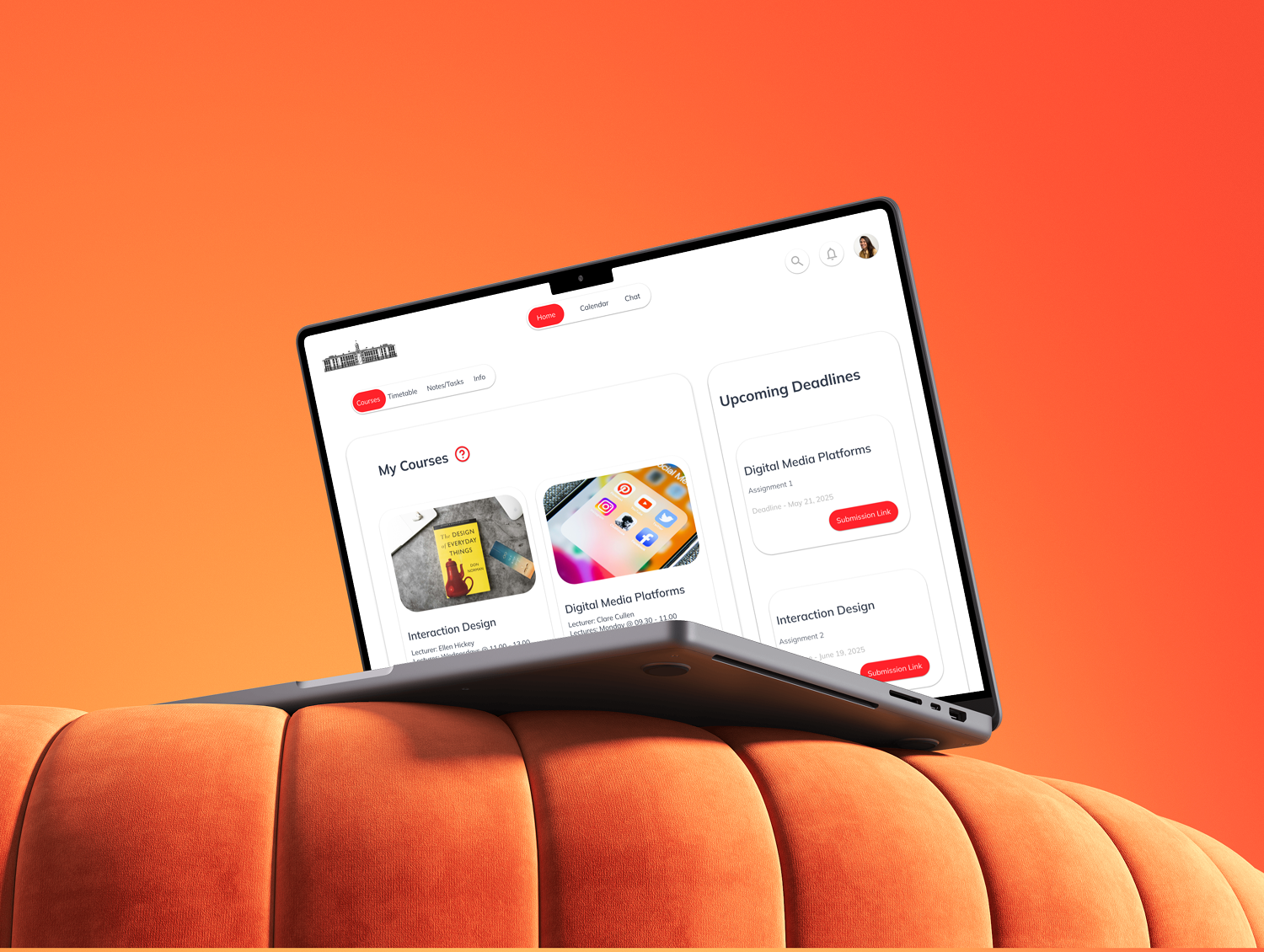
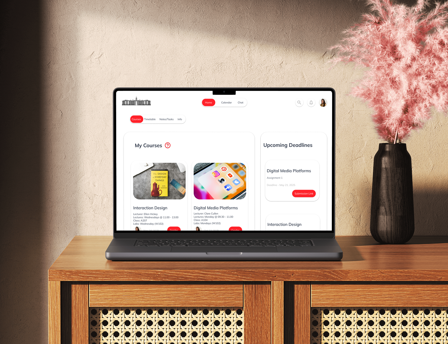
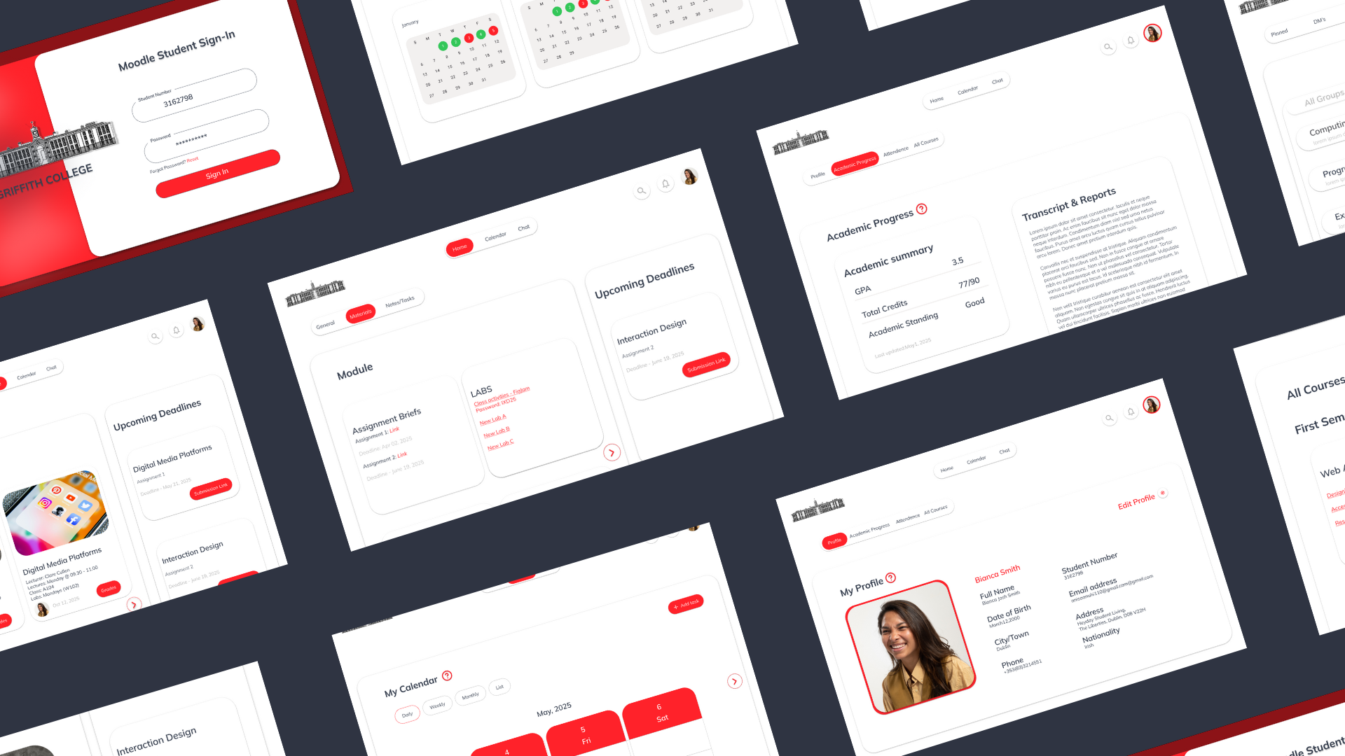
Building the core experience: the dashboard as a working surface
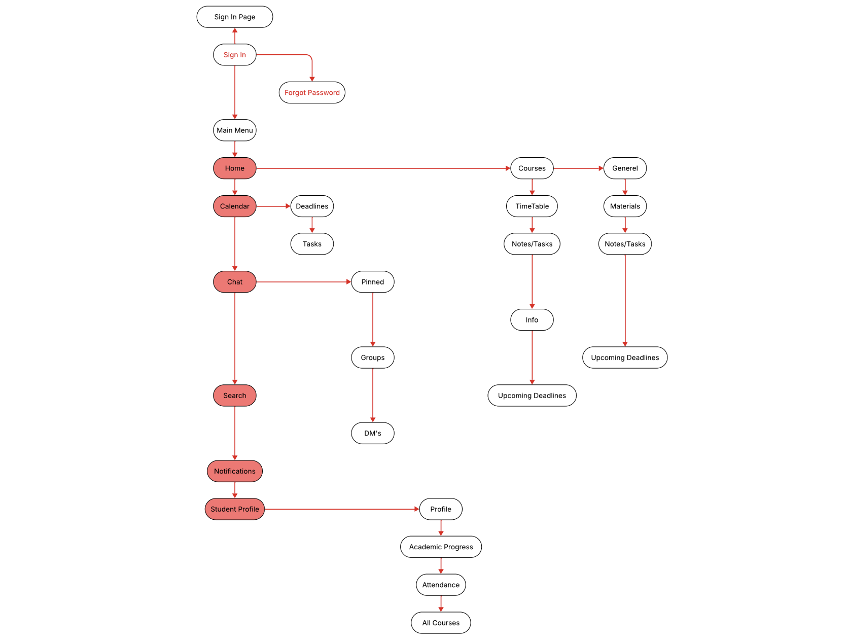
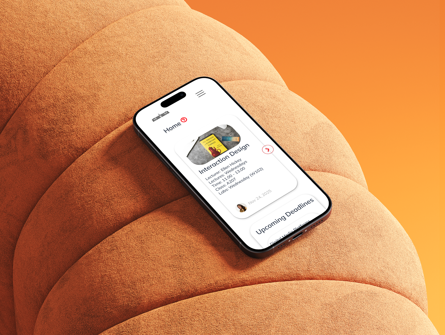
We treated the dashboard like a student’s desk a place to see current work and take action. The key design decision was to centre the dashboard around time-sensitive, actionable content:
- Top area: “Now” panel. This shows the next 3–5 actionable items (assignments due, unread feedback). The idea: when a student opens Moodle, they should immediately see “what I should do now.”
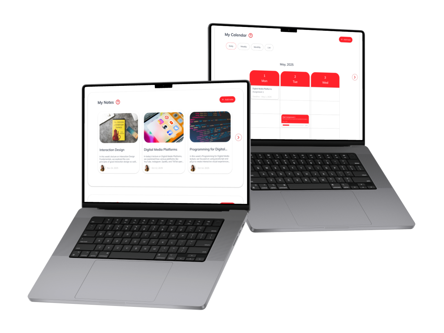
- Calendar at a glance. Instead of burying deadlines in separate course pages, we surfaced them in a visual calendar. This created an obvious mental model: time-bound work is visible and schedulable.
- Course cards with progress. Each course card shows quick progress indicators (percent complete), next tasks, and a one-click link to the course’s assignment view. This reduced the clicks needed to get to real work.
Design detail
Cards use clear visual hierarchy title, small progress bar, one-line next action and hover states show quick options (open, message instructor, view resources). These micro-interactions give feedback and reduce the mental friction of deciding “what to do next.”
Why this worked
Students told us that seeing a concise “now” list and a calendar removed the need to hunt. It turned Moodle from a filing cabinet into a planner.

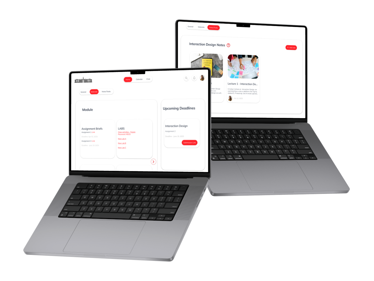
Reducing tool-switching: tasks, notes and study spaces
A recurring pattern in interviews was the use of external apps (Notion, Slack). Instead of trying to replace them entirely, we integrated the high-value parts of those tools into Moodle:
- Integrated task list: Students can convert an announcement or a file into a task, pin it to their dashboard, and mark it done when complete.
- Quick notes: Lightweight note cards allow students to capture reminders alongside course content.
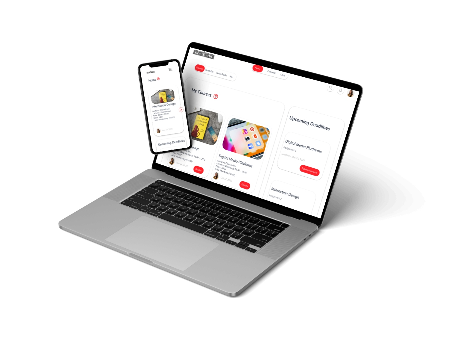
- Group channels: A simplified Slack-like space per course for study groups and coordination, with threaded replies for clarity.
These features were intentionally stripped back not full Notion or Slack clones, but tightly-scoped utilities that kept students inside the VLE. The design decision was deliberate: build the minimum viable integrations that solve the core problem (context switching) without adding complexity.
Iteration through testing: what we learned and changed
We ran five rounds of usability testing with students performing realistic tasks: find the next assignment, submit on time, find instructor feedback, and create a study group. We watched, timed, and asked students to “think aloud.”
Key outcomes and how we responded:
- Before: Many users took several clicks to find an assignment.
- After: With the dashboard “Now” panel and calendar, task completion time dropped about 40%. Students reached the assignment page much faster.
- Before: Students missed deadlines because announcements were hard to find.
- After: Centralized notification feed + calendar alerts made upcoming deadlines obvious. Students reported feeling “less anxious” about missing tasks.
- Before: The multi-layer menu confused navigation flow.
- After: We flattened the menu and added contextual breadcrumbs; usability scores improved and qualitative feedback showed students felt more confident.
We also discovered things that sounded good but didn’t help in practice. For example, an elaborate course card with expandable accordions was visually interesting but slowed scanning. We removed the accordion and clarified the card content instead. That scrapping felt small but it increased scan-ability dramatically.

Desktop-first, purposeful visual choices
Because the project focused on desktop, many of our spacing and layout choices were driven by how students read dense information on larger screens:
- Whitespace as a guide. More breathing room around cards made it easier to scan a course list.
- Type scale and chunking. We used a clear typographic scale so headings, dates, and actions were obvious at a glance.
- Color for hierarchy, not decoration. Accent blue highlights CTAs and progress; muted greys keep the background calm. The goal was to reduce visual noise so students could focus on tasks.
- Feedback-driven micro-interactions. Subtle hover states, confirmation toasts for submissions, and inline error messages to guide users each interaction aimed to reassure and remove doubt.
These aren’t cosmetic choices they’re behavioral ones. When a student clicks “submit,” a small success animation and a clear status update removes the question “did it work?” and reduces the cognitive load of waiting.


.png)

-1.png)
-1.png)

.png)

Accessibility and practical compromises
We didn’t run a full audit in this phase, but accessibility informed our decisions. We chose high-contrast text, ensured clickable areas were large enough for keyboard and touch use, and added clear labels and ARIA-friendly markup to the design spec. The colour palette and typography choices were tested with a few students with different visual needs and performed well though a full accessibility audit is a clear next step.
Outcomes - what changed for students and staff
The redesign delivered more than visual polish. In our test cohort:
- 90% said the new dashboard felt clearer and easier to use.
- ~40% faster average time to locate assignments compared to the old system.
- Lecturers reported upload and communication flows were easier to follow, and felt more confident that students could find materials without repeated emailing.
Beyond metrics, the real change was behavioural: students who previously used external tools told us they felt more willing to try the integrated task tools, simply because they were visible in the place they already used for learning.
What we’d build next
This project proved that small, focused UX interventions can make a complex system feel usable again. Next steps I’d prioritize:
- Build a working prototype on a live Moodle instance and test with real course data.
- Design the mobile experience end-to-end (we prototyped mobile visuals but did not complete mobile design in this phase).
- Run a full accessibility audit and remediate any issues.
- Measure engagement over a semester (bookmark conversion, calendar interactions, assignment on-time rates) and iterate from the data.
Final note
Redesigning Moodle wasn’t about making something pretty it was about creating an academic tool that earns students’ attention by being useful. We moved from an environment that hid important work inside menus to a workspace that surfaces what matters right now. That shift from filing cabinet to working desk is the heart of good UX in education.
