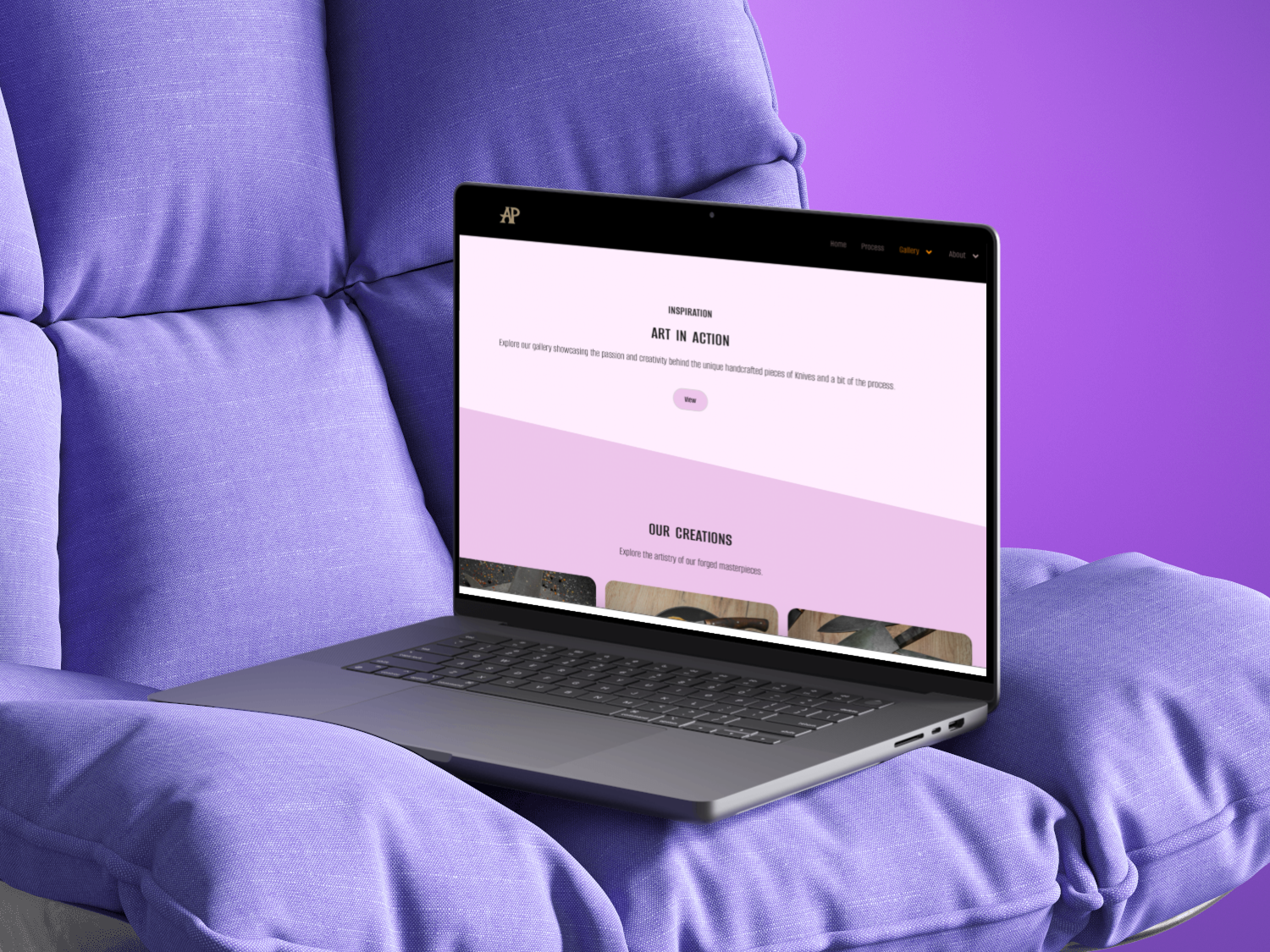
Niger splitpay
Project Overview
Niger SplitPay is a fintech app designed to streamline bill splitting and group payments for friends, roommates, or small organizations in Nigeria and beyond. It tackles a common pain point: managing shared expenses in a still largely cash-oriented or peer-to-peer transfer economy. (For context, cash once dominated Nigeria’s economy, with over 90% of transactions in 2019 , though digital payment adoption is rapidly rising.) The core value proposition is a low-friction, trust-centered experience where users can create a split, add participants, and settle payments in a few taps. As the sole Product Designer, I owned the end-to-end UX process – from research and flows to hi-fi interface and testing.
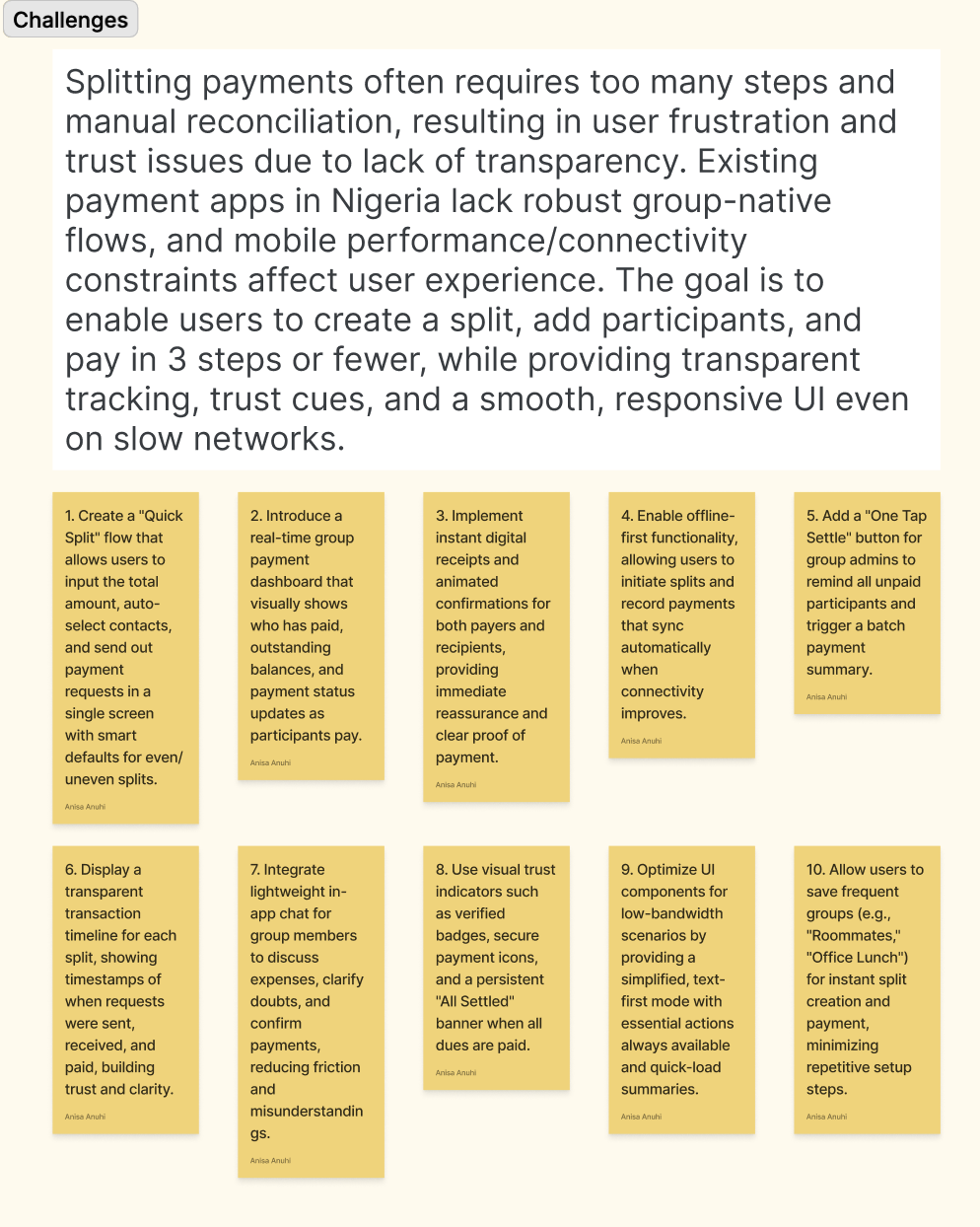
challenges and design goals
- Complex flows & manual work: Traditional bill splitting often involves messy multi-step processes (calculating amounts on paper or a calculator) and multiple transfers. This creates friction and confusion.
- Trust & transparency: In prior payment apps, users sometimes feel uneasy when transaction status or histories are unclear. Any hint of confusion can make people distrust digital payments .
- Group-specific features: Leading Nigerian fintech apps excel at one-to-one transfers but often lack native support for multi-person flows (e.g. one click “split dinner” vs manual group chat).
- Connectivity constraints: Many users in Nigeria (and similar markets) face inconsistent mobile data. App flows must assume intermittent networks (offline-first design) so that the UI remains responsive and data syncs reliably .
Design Objectives
- Streamlined flow: Enable setting up and sharing a split in three steps or fewer.
- Visual clarity: Provide an instantly understandable breakdown of who owes what, with clear status indicators (e.g. color-coded paid/unpaid).
- Trust cues: Use UI signals (confirmations, receipts, progress indicators) to reassure users at every step .
- Performance: Optimize for low bandwidth (minimal images/animations, local data caching) to ensure smooth experience even on slow networks
Research Insight
Through user interviews and surveys (20 participants in Nigeria who regularly share bills), we uncovered key patterns:
- Manual calculations: Many users still split bills with pen/paper or their own calculators. They want the app to do the math for them.
- Need for reminders: People ask each other to pay using their own memory or manual nudges. They prefer automated notifications or payment requests to gently remind participants.
- Clarity is critical: Users reported that confusion over “who owes what” is the biggest deterrent to using digital splits. They value a tidy, visual breakdown of contributions and balances.
- Trust in UI cues: Participants repeatedly mentioned feeling secure when the app shows clear feedback e.g. a real-time animation of a digital receipt or a “Payment Complete” toast. Visual progress bars, color changes, and confirmation dialogs make them feel in control .
- Benchmarking: We analyzed apps like Splitwise (for multi-user flows) and popular Nigerian payment apps (Moniepoint, Paystack). Most lacked built-in group split flows or trust-centric animations, confirming an opportunity.
These insights guided each design decision: for example, the focus on visual status cues and reminders directly addresses user feedback that they “trust UI cues and hate ambiguity.” One Nigerian design leader even notes that startups must “emphasise visual trust cues; security confirmations, progress indicators, and feedback loops” to build confidence .


Primary Persona
- Folake Adekunle, 29 – Lagos-based marketing exec, splits utilities, rent, and groceries with three roommates.
- Goals: Quickly settle shared bills without awkward conversation; get a clear, consolidated view of each person’s contribution; receive automatic reminders so she doesn’t have to chase friends.
- Pain Points: Current apps require too many taps and context switches, and it’s easy to get lost mid-flow. Folake often doesn’t know if a flatmate has paid until several messages in. She also feels uneasy when there’s no immediate feedback after she clicks “Pay” – the lack of a digital receipt or status update gives her doubt.
(Other personas included a small event organizer in Abuja and a student abroad, each reinforcing the need for simplicity and clarity in group finance flows.)

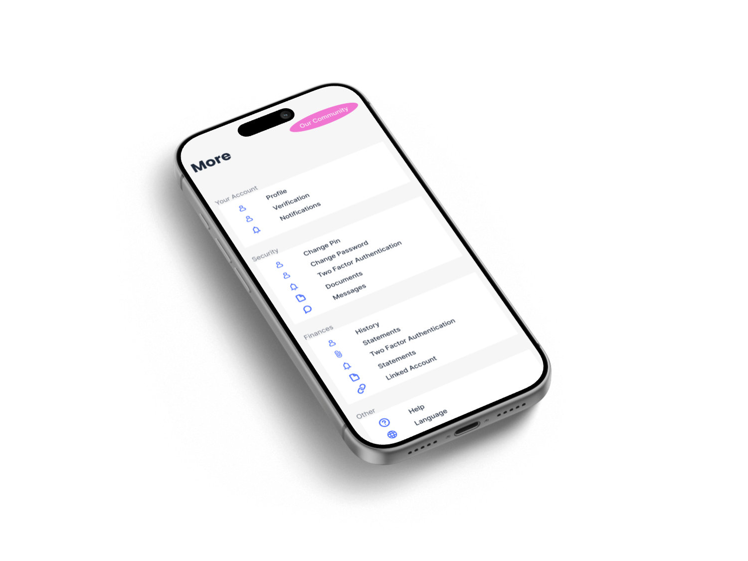
Information Architecture & flow
The user flow was structured around minimizing steps and maximizing clarity:
- Home/Dashboard: Shows all active splits at a glance – e.g. “Electricity Bill (3 people) – ₦5,000 – 2 unpaid”, plus quick links to create a new split.
- New Split: A simple 3-step wizard: (1) Enter total amount and description; (2) Add participants (from contacts or by phone/ID) and set individual amounts; (3) Review and “Create”. On creation, a sharable link or QR code can be sent to participants.
- Split Details: A screen listing each person, the owed amount, and current status (Paid/Unpaid). Users can tap a person’s name to “Remind” or “Mark as paid” (in case of cash).
- Payment: Within the split details, a one-tap “Settle Now” button initiates a transfer using the linked account. A loading animation transitions to a “Payment Successful” confirmation screen.
- History/Activity: A chronological log of all splits, payments, and receipts, so users can audit old events. Each entry shows date, participants, and a link to view the receipt.
(Wireframes were sketched first to validate these flows quickly; the final IA adhered tightly to the three-step goal. At each flow junction, we reduced extraneous fields and labels to prevent user drop-off, following best practices for clarity .)

ui Design Approach
The visual style balances modern minimalism with subtle Nigerian flair:
- Color & Typography: A clean palette (tan/light backgrounds, green accents for success, red or gray for pending). Green is used consistently to indicate “Paid” or “Settled,” while orange/gray denotes pending amounts, making status instantly recognizable. A sans-serif font ensures readability on small mobile screens.
- Layout: Modular card layouts with ample white space. Each split or transaction is presented on a card with clear icons. This reduces cognitive load and aligns with mobile UI conventions.
- Trust Cues & Microinteractions: Following research and guidelines on fintech trust , we sprinkled the interface with reassuring details. For instance, on login and sensitive actions, padlock icons and a “Securely encrypted” note appear (a pattern known to build user confidence ). When a payment completes, a brief animated receipt “flies” into the user’s inbox icon. After each split is created, a progress bar shows distribution. These microinteractions provide real-time feedback – every click “reassures, not confuses” the user .
- Offline-first considerations: While designing the UI, we assumed spotty connectivity by default . This meant minimal heavy graphics or videos. Instead of loading large images, the app uses cached user avatars and relies on brief skeleton screens during network calls. When the network is off, actions like “Remind friends” queue locally and sync once online. We designed all key feedback (e.g. “Payment queued – waiting for connection”) to be visible so users never wonder if the app froze.
“Clarity equals confidence,” noted Nigerian design experts. By keeping the UI uncluttered and adding clear labels (and sometimes short explanatory tooltips), every action has predictable results . For example, a toggle switch clearly indicates whether everyone has paid, and a locked padlock icon flags completed payments. In usability tests, participants repeatedly praised these signals: one said, “I immediately trust the app when I see a checkmark and green color.”


Final Outcome
The Niger SplitPay prototype delivers a fast, transparent shared-payments experience:
- 3-Step Split Creation: Users can set up any group expense in under 3 taps, as intended. Field validation (e.g. sum of parts equals total) is done in-line to avoid errors.
- Transparent Status: The split detail screen clearly shows at-a-glance who still owes money. Each participant’s card highlights “Paid” in green once settled or “₦X due” in red if pending. This visual clarity aligns with user feedback about needing a tidy breakdown.
- Trust-Centered Feedback: Transactions generate an instant on-screen receipt and an email copy. After pressing “Settle,” the user sees a loading spinner followed by a “Success!” screen; a brief haptic feedback (vibration) also confirms the action. All these reinforce that the payment went through. (Such signals are known to make users feel “in control and safe” .)
- Optimized Performance: Even on a simulated slow network, the UI remained snappy. We employed local storage for unfinished splits and optimized all assets. No full-page reloads are needed after any action; partial screen updates keep the experience fluid.
- Prototype Demo: (Interactive prototype links and screen mockups were produced, showcasing flows from Onboarding to Final Receipt. In testing sessions, all users successfully completed the core tasks with minimal instruction.)
Result: A user can go from “I have a ₦10,000 dinner bill” to “Everyone’s paid” in just a few minutes, without confusion. The interface’s trust cues and confirmations noticeably reduce hesitation around money – for example, survey participants reported feeling “much more confident” about splitting bills when the app gave immediate receipts.


Reflection & Next Steps
Key Learnings: Fintech design is as much about emotional reassurance as it is about functionality. We found that simple microinteractions (animated receipts, checkmarks, clear status colors) significantly boosted user confidence a point echoed by industry experts . In Nigeria’s ecosystem specifically, treating unreliable connectivity as a given (the “offline-first” mindset) was crucial. Apps that only work on perfect 4G/5G will alienate many users ; our fallback strategies (caching, USSD fallback plans, minimal asset use) ensured wider accessibility.
Future Directions: To evolve this product, future versions could add group savings or lending features (users could pool funds for a trip or loan track). We also plan to incorporate analytics dashboards so users see their group spending trends over time. Finally, expanding to other markets adapting currency, date formats, and local payment rails for West/East Africa would broaden impact. Each new region will require fresh user research; as one Nigerian UX leader cautions, solutions must respect local behaviours and trust cues .
By centering the design on user pain points, trust, and network realities, the Niger SplitPay case study exemplifies a mature, user-first approach to fintech UX one that a senior designer would champion.
Sources: Industry reports and expert commentary on fintech UX and the Nigerian market have been referenced to inform and validate these design decisions .