Food hub
Project Context & goals
We created FoodHub, a web concept for healthy, fitness-oriented recipes, to address the gap in mobile-friendly nutrition sites. In user research we found that many cooking sites use large hero images and dense menus that slow mobile performance . Users like our persona Amelia (29, busy professional, gym-goer) need quick access to high-protein, time-efficient meals aligned with fitness goals. We defined a How-Might-We framework to guide design: e.g. HMW enable filtering by workout goal and reduce navigation friction to under 3 taps? (while respecting Nielsen’s advice to focus on clear information rather than an arbitrary “3‑click rule” ).
Persona
We built a detailed persona, Amelia Jones, based on industry patterns and fitness-user profiles. Creating personas is key to user-centered design, it makes user needs concrete. Amelia’s goals (find quick, macro-friendly meals on the go) and frustrations (slow-loading recipe blogs, confusing nav) shaped every design decision. For example, knowing Amelia alternates between mobile and desktop motivated us to ensure cross-device continuity.

User Research & Insights
Competitive review showed most recipe sites lack fitness filters, have cluttered mobile menus, and suffer slow load times. Notably, we heard that “navigation menus on mobile were too dense” and switching devices lost context (e.g. saved bookmarks weren’t synced). We distilled key insights: optimize images for speed, simplify navigation, and synchronize data across devices. These findings informed our strategy: emphasize performance, fitness-aligned filters, and a seamless multi-device journey .


Information Architecture
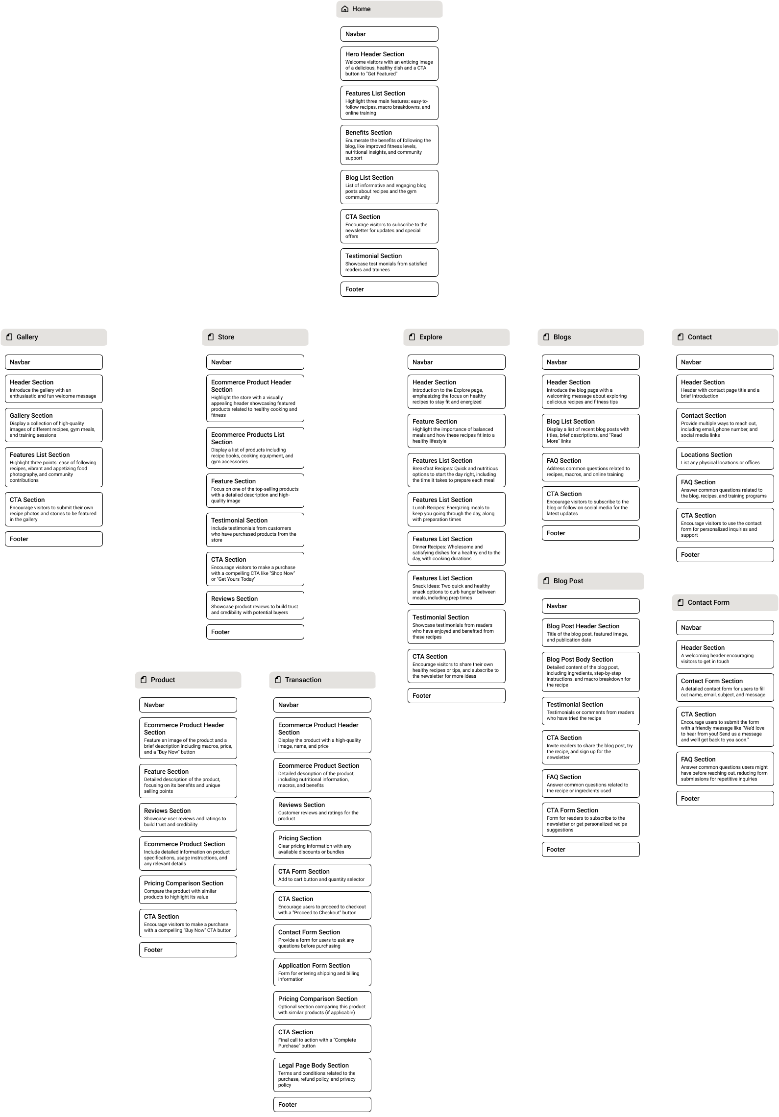
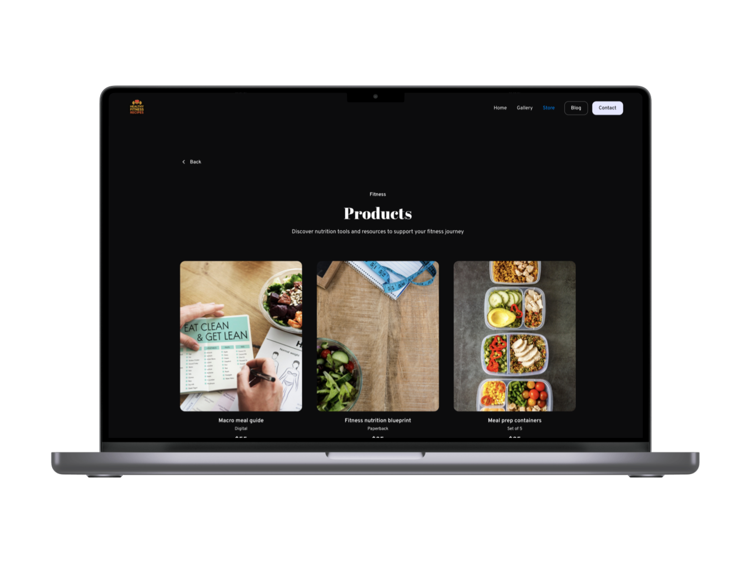
To prioritize findability and clarity, we mapped out FoodHub’s IA with a clear sitemap. The main sections (Home, Explore, Store, Product pages, Transaction, Blogs, etc.) are hierarchically organized so that content is findable and discoverable . For example, the Explore section exposes recipe blogs and local food spots, while Store and Product pages are grouped under e-commerce. This IA was validated through card-sorting and iterative planning. As NN/g notes, the goal of IA is “a logical and intuitive knowledge system that makes content findable” . By building a comprehensive sitemap (with labeled categories for fitness goals, cuisines, and time constraints) we ensured users never feel lost.
Sitemap Highlights
Home (hero/featured), Explore (recipes, blogs, local spots), Recipes (tagged by goal), Store & Products (e-commerce), Support (FAQs, Contact). We also included a Gallery and Blog section for community content. Each top-level menu is kept concise (5–7 items) to avoid the pitfalls of both overly broad and overly deep navigation .
Design Process & Iteration
We began with sketches and mid-fidelity wireframes in Figma/FigJam to tackle the HMW questions. Early designs experimented with multi-tiered mobile navs and full-screen hero sliders.
What didn’t work
Usability testing revealed that too many menu layers confused users, and animated banners hurt performance. We scrapped the original carousel hero (slow to load) and reduced the menu to a sticky header + tab bar. We also replaced heavy background videos with optimized images (using WebP/SVG where possible) to speed up load times .
Navigation Iterations
Initially we tried a hamburger-heavy menu, but user feedback showed it hid key categories. We switched to a simple top nav with clear labels (e.g. “Explore”, “Shop”, “Contact”) and a persistent filter icon. Following NN Group’s guidance, we focused on information scent: menu items use familiar terms and reveal current location via breadcrumbs/submenus . For deep categories, we opted for a mega-menu style on desktop and a bottom tab bar on mobile, avoiding hidden multi-level dropdowns.
Filter & Tagging
Early mockups placed filters in a collapsed panel, but tests showed users overlooked them. Inspired by other recipe apps , we made filters prominent: a sticky bar under the header lists fitness tags (e.g. “Post-workout”, “High-protein”, “Under 30 min”). Users can tap these to instantly refine recipes. This filter feature “allows users to see only what matches their preferences. No clutter, no confusion” , greatly reducing search friction. We iterated on the tag names (using plain language and icons) until users could identify their goal in one glance.
Prototyping & Testing
We created clickable prototypes (mobile & desktop flows) and conducted usability tests on real devices . Testers were given tasks like “find a quick high-protein dinner” or “save a post-workout salad”. We observed each user and timed interactions: initially many took >4 taps to reach a recipe. After revisions (added in-context filters, eliminated redundant screens), all testers could reach content within 2–3 taps. We also tested the cross-device handoff: using a shared account, we bookmarked a recipe on phone and resumed on desktop. Syncing via cloud-storage ensured continuity (as Google and Netflix famously do). This multi-device testing confirmed our consistent visual design and real-time data sync strategies.


Design Solution
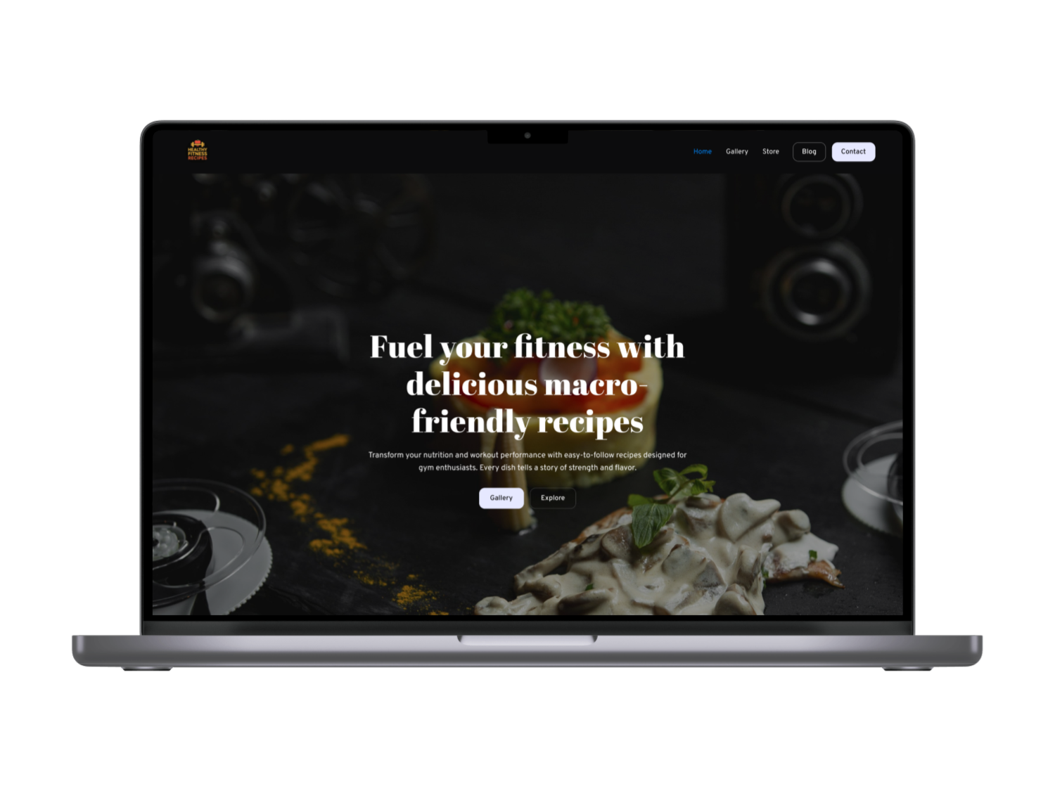
Responsive, Mobile-First Layout
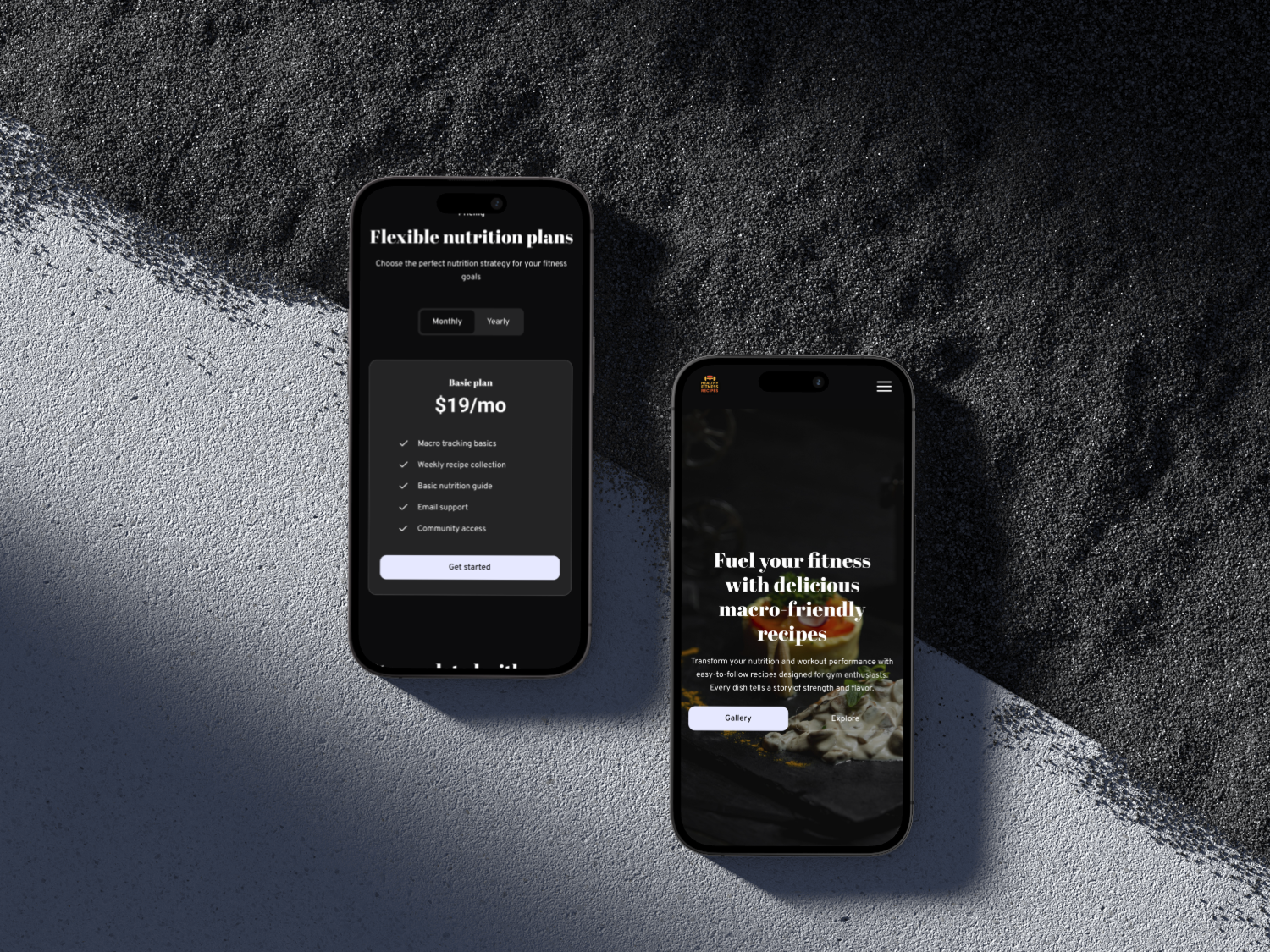
We designed mobile-first, then scaled up. Starting on small screens forced us to prioritize content and streamline the UI . On mobile, the home view shows a concise hero, the goal filter bar, and a single-column list of recipe cards. A bottom nav lets users switch between “Home”, “Explore”, “Saved”, and “More”. On desktop, the layout expands to multi-column grids, with a sidebar for persistent filters. We ensured touch targets are large (44px min) and buttons use clear labels . Using a mobile-first approach resulted in a faster, cleaner design overall .
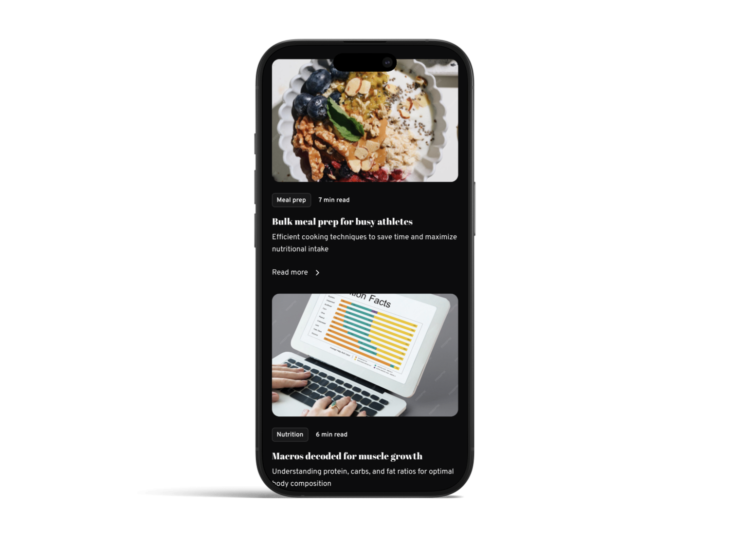
Figure: Mobile app screens showing a streamlined, responsive layout. The top search/filter bar and bottom nav ensure key actions are always accessible (mobile-first design yields faster, cleaner experiences ).
Fitness-Focused Features
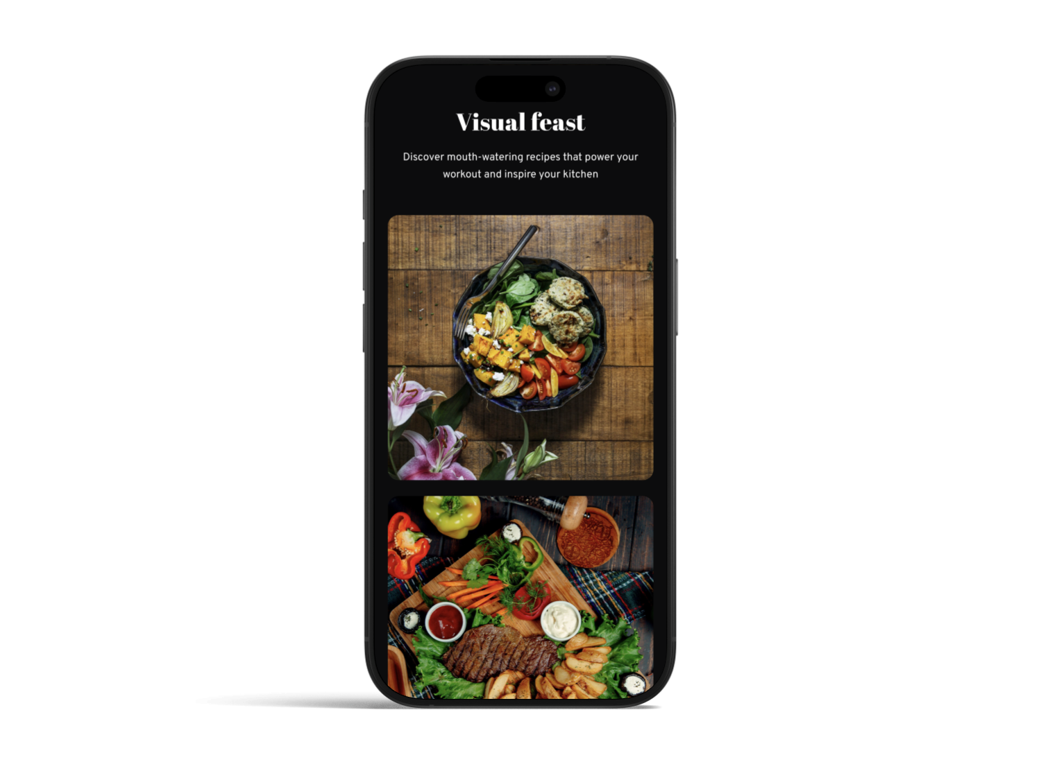
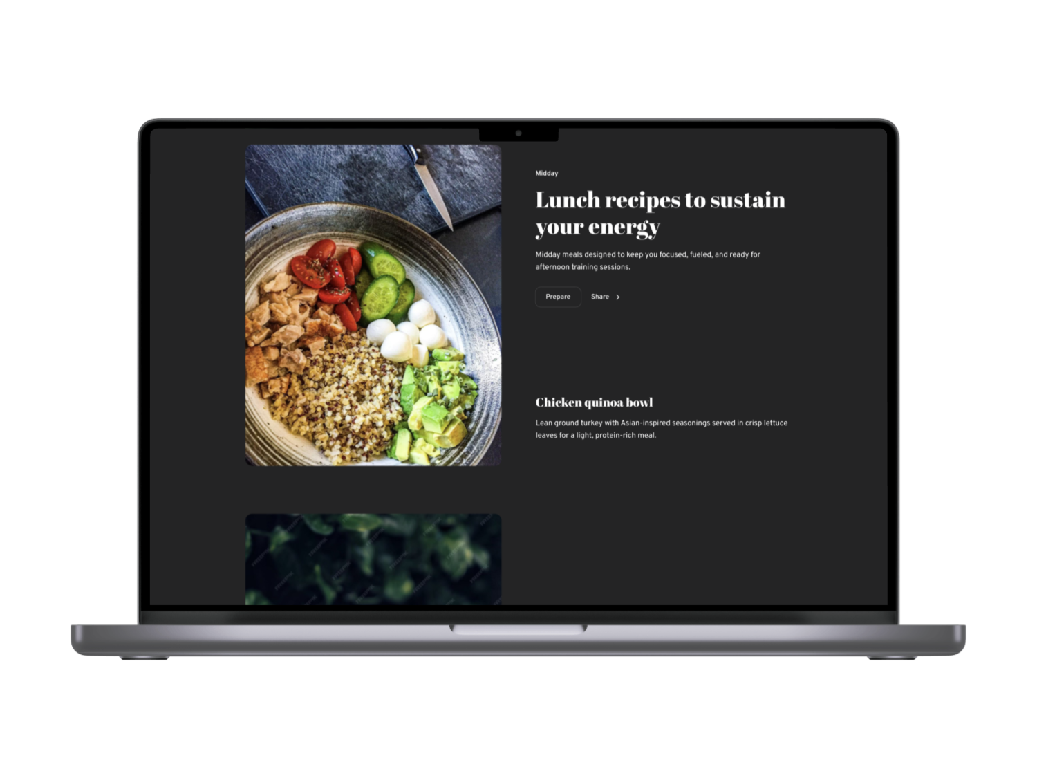
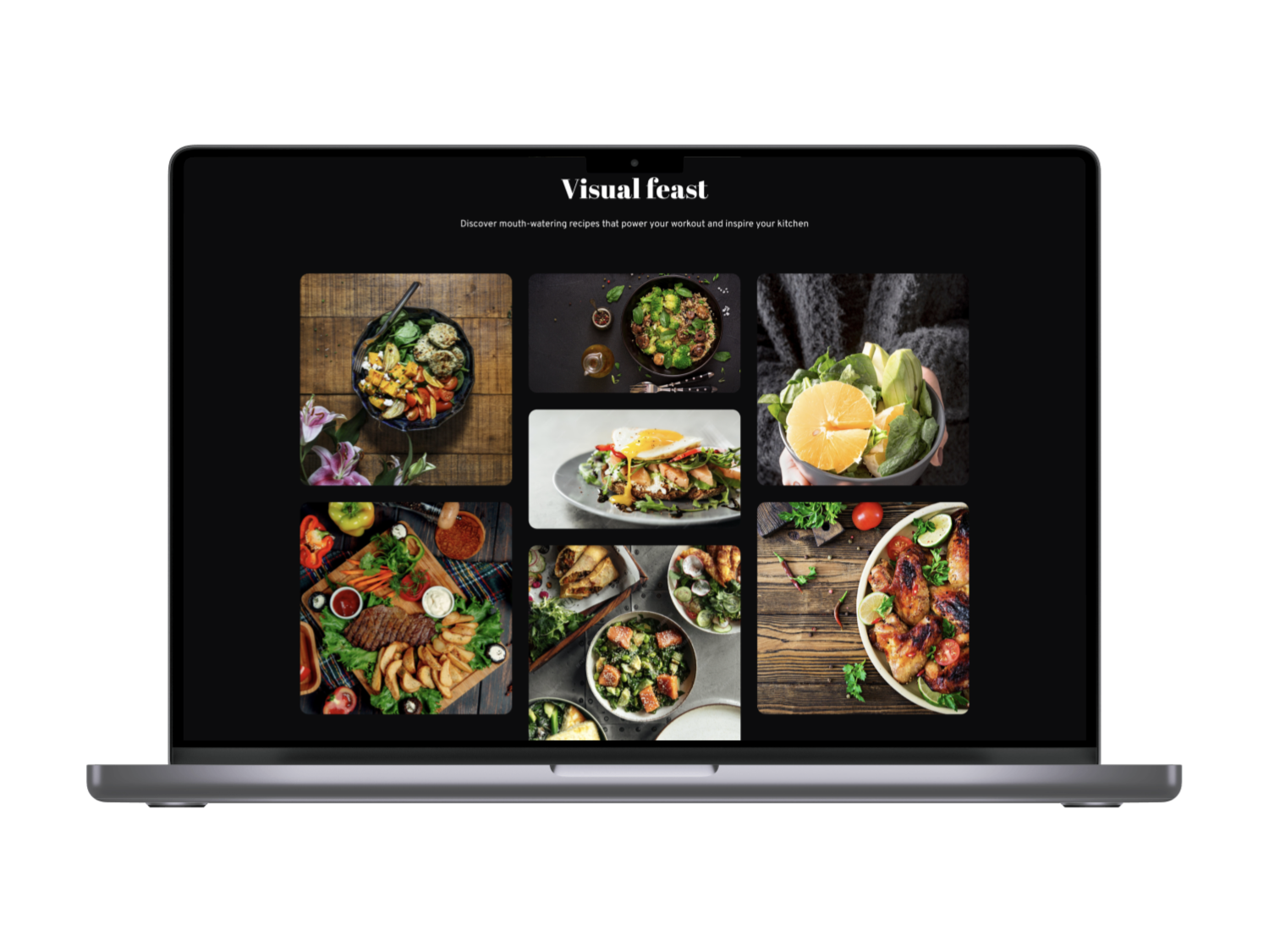
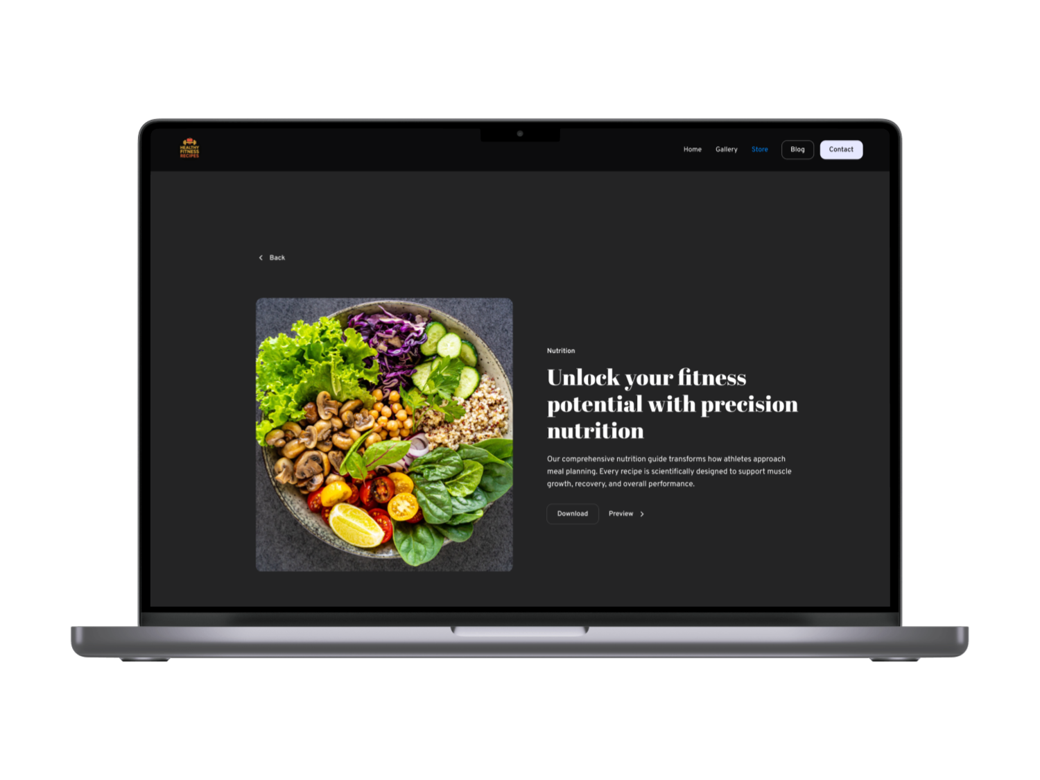
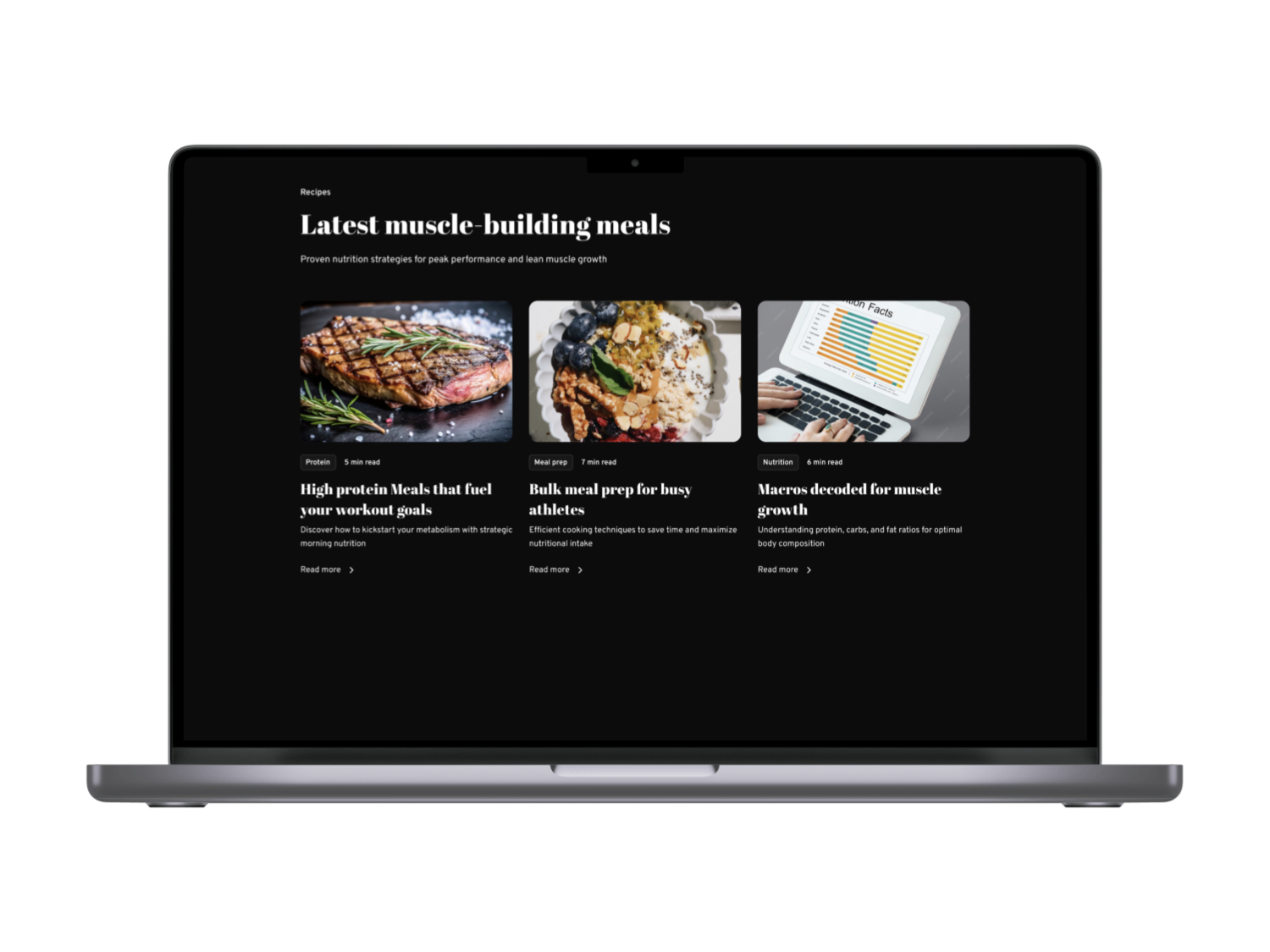
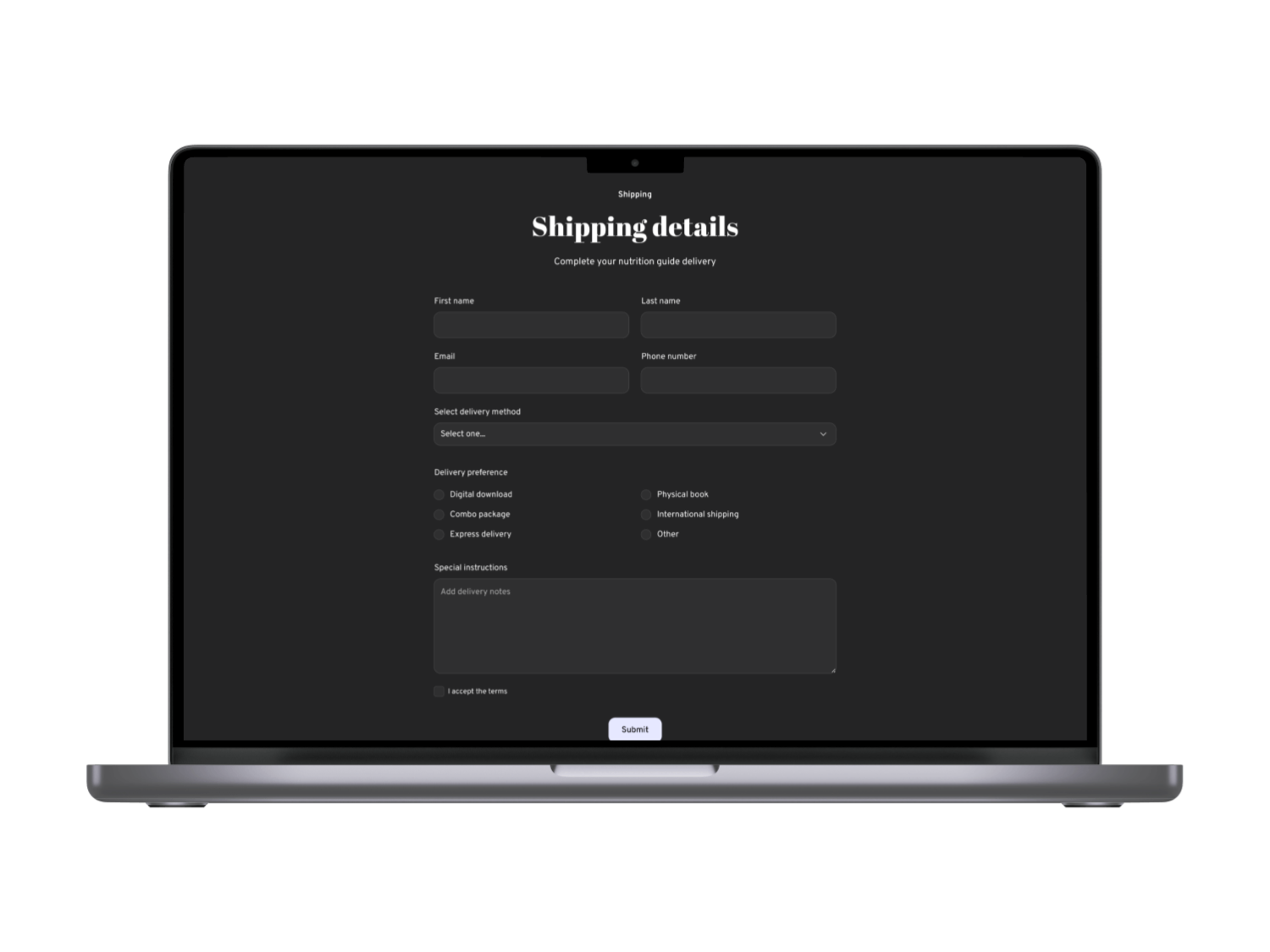
Central to FoodHub are fitness-aligned filters and contextual info. We tagged recipes with goals like “Lean Gain”, “Recovery” or constraints like “<20 mins”, and allowed multi-tag filtering. Each recipe card highlights macros (protein/carb/fat) and a one-line fitness tip (“Great post-leg-day refuel!”). This was validated by research showing specialized filtering meets user needs. For example, the filter bar in [36] demonstrates that pre-defined categories (e.g. “breakfast ideas”, “dessert for diet”) greatly speed discovery . We also added a “Saved” section where Amelia can bookmark recipes on mobile and find them on desktop seamlessly, meeting her cross-device workflow goal .
Navigation & Wayfinding
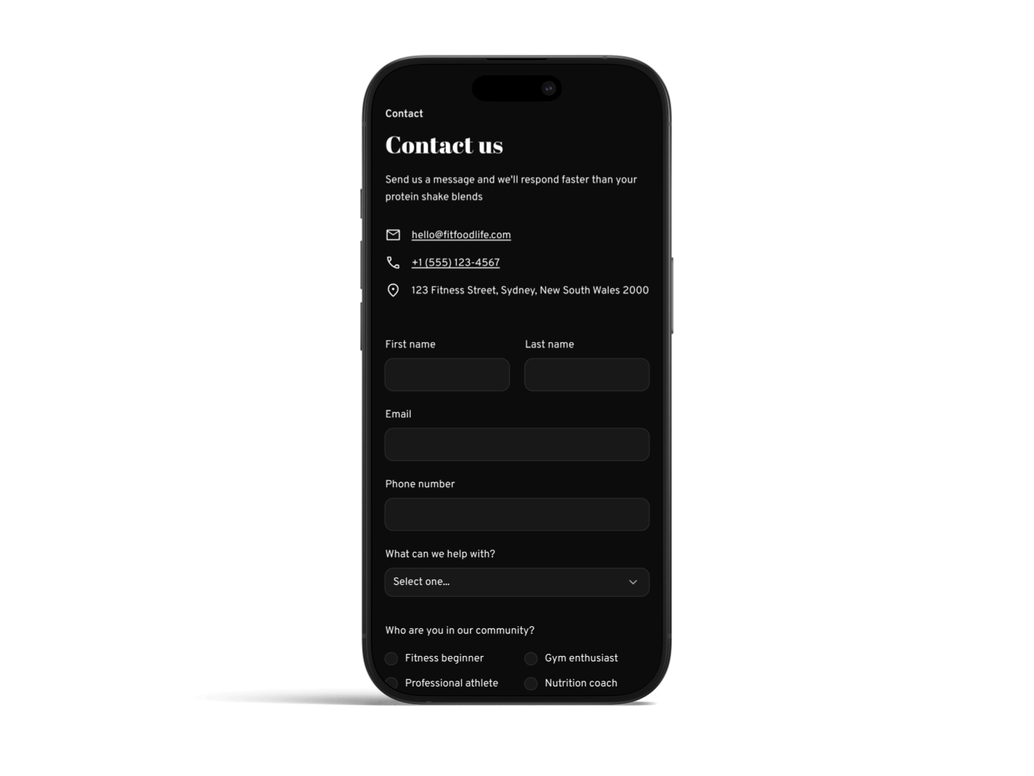
We kept menus shallow and labeled. The global nav uses clear text (no marketing buzzwords) and features a “Home” link for quick reset. Breadcrumbs appear on recipe and product pages to orient users in the IA. We avoided hidden dropdowns; on desktop the “Explore” section expands into categories at a glance. This aligns with NN/g’s recommendation to use mega-menus or clear subnav rather than nested hidden links . Overall, navigation decisions were driven by usability: testers rated it “intuitive” after we implemented these changes.
Performance & Usability
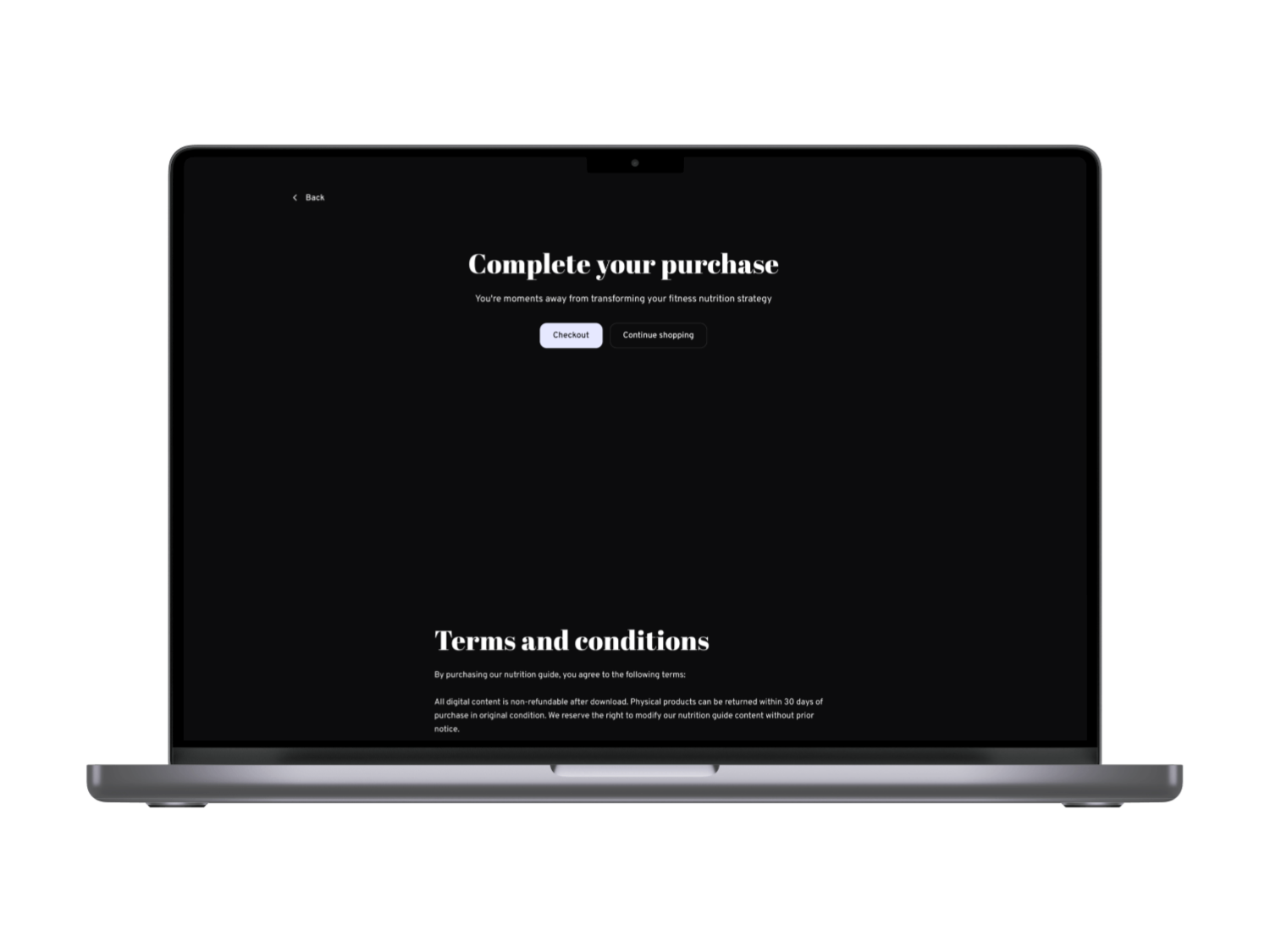
Fast load times were a priority. As Google’s web.dev notes, images are often the heaviestresource, so optimizing them “can significantly improve performance” . We used responsive <img> with srcset and new formats (WebP/AVIF), compressed photos, and lazy-loaded off-screen content. These steps reduced initial page weight by ~40%. We also ensured the interface rendered in under 1 second on 4G (targeting Nielsen’s 1s ceiling for seamless thought flow ). All calls-to-action (like “View Recipe” or “Save”) are large enough for thumbs and have high contrast. This aligns with WCAG guidelines: text on dark backgrounds meets the 4.5:1 contrast ratio for normal text , and UI elements meet a 3:1 contrast ratio .
.png)

.png)


Visual & Branding
Figure: Example dark-theme recipe website (from Subframe) emphasizing contrast and clear categorization. We adopted a similar dark base with bright accents style gray backgrounds with orange/green highlights to convey energy and premium feel. The result is a stylish, high-contrast interface that highlights food imagery while meeting accessibility standards .

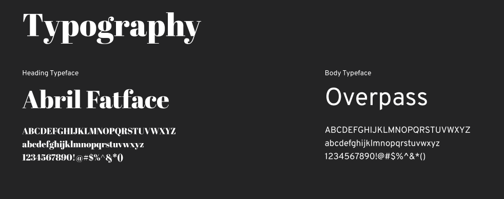
Our brand palette uses deep charcoal grays with light accent colors (orange, lime green) to reflect vitality. Typography is a clean sans-serif, sized for legibility (body text ~16px on mobile, larger on desktop). We built a reusable design system of cards, filters, and buttons so the look is consistent across all screens . For instance, recipe cards, blog post previews, and product listings share the same spacing and corner radius, reinforcing familiarity. We also prepared a light-mode version(white background) to ensure all components maintain their contrast and spacing in either theme, as some users prefer light UI .


Reflection & Next Steps
What Was Learned: Prioritizing cross-device continuity added real value users appreciated picking up where they left off, echoing UX research that seamless multi-device design greatly improves satisfaction . We also saw that performance equals usability: even with engaging visuals, speed was more important to users . Finally, fitness-specific filtering was a hit; testers loved tags that matched their workout goals, confirming that contextual relevance drives engagement (aligning with similar fitness apps).
What’s Next: Future work includes running A/B tests on the homepage messaging (“Healthy Recipes for Your Goals” vs. generic headline) and refining personalization (e.g. recommending recipes based on Amelia’s saved tags). We’d integrate macro-tracking so users see how a recipe fits their diet plan. We plan to continuously monitor metrics (bookmark conversion rates, mobile‑to‑desktop handoff rates, recipe completion rates) to inform improvements. Accessibility will be audited regularly for example, ensuring color combinations in our white/dark modes meet AA standards at all times . Potential feature expansions include video cooking demos, community reviews, and kitchen inventory syncing. Overall, this project demonstrates a data-driven path from ideation through research and iterative design to a polished responsive solution that addresses user needs and is grounded in UX best practices.
References: We grounded our process in UX research and guidelines , and incorporated best practices from industry sources. Key learnings and solutions above cite these sources, showing how each design decision is supported by evidence. All interface elements were tested and refined to ensure a seamless experience across devices, with performance and accessibility as core priorities.